Activity trackers and Analytics
What do data analytics, the outdoors, cool tech and navigation have in common? They are all things I'm pretty passionate about, so being a bit of a data geek, I brought them all together.
I spend a lot of time out doors, walking our mad Chocolate Lab (Bobby), Kayaking the lakes, rivers and beautiful coastline of the North of England, Stand up paddle boarding or supporting mass participation water sports events as a life guard.
Through all these activities, I like to track distance and other stats via my Garmin watches. (Yes, I have more than one, though usually only wear one at a time), so that I can compare the same or similar activities.
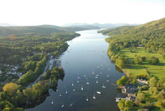
The activities shown here take place in the Lake District, in the North West of England. One of my favorite locations anywhere in the world. A landscape of beautiful green mountains, large (for the UK) lakes and flowing rivers.
Lake Windermere is the largest lake in England, one of 16 in the Lake District. A common pub quiz question is 'How many lakes are in the lake district?' - There are actually only one officially named a lake, Lake Bassenthwaite, the other 15 are either Meres or Waters.
Windermere is 10.5 miles long (18km) and around 200ft deep at its deepest point. Starting at Fell Foot, a National Trust property at the South of the lake and ending in Ambleside at the north.
The Problem
Garmin have a great website, full of nice visualisations of activity and a mobile app where you can view tracked activity data.
That's great, right up to the point you want to compare two activities, here it falls down. Other than seeing high level stats side by side, you cant.
The Windermere One Way is an annual swim in which around 300 swimmers take on the challenge of swimming the full length of the lake. A both physical and mental challenge as they are in the water between 6 and 10 hours, each swimmer is allocated a support kayaker who is responsible for supporting the swimmer, navigating the length of the lake and keeping the swimmer on track, safe from the multitude of commercial and private pleasure craft, a chain pulled car ferry, the cold, cramps and carrying their sustenance.
Paddlers are given guidance as to the route swimmers must take along their journey, usually headland to headland navigation along the lake, but the more accurate a paddler navigates, the less distance their swimmer ends up swimming to reach their goal of swimming the full length of Windermere (around 11 miles).
So, the more I can view the routes I paddle, the more I can look to adjust the route next time to minimise the distance and time in the water for my swimmer.
The solution
Build my own analytics tool to allow me to compare not only statistical data, speed, stroke rate, distance, etc.. but look at the actual GPS trace of the route.
Using a 'free' desktop version of the platform we have adopted to form the front end to our Insights platform, Qlik Sense and activity data downloaded from Garmin Connect I wanted to see how I could visualise the data and build something which gave me what I wanted.
The How
For every activity I have in Garmin Connect, there is an option to download 4 files, 2 csv files, a GPX file (Geo spacial data) and KML file (Google Earth). I started with all the files, importing them in to Qlik Sense to understand what data they contained and what I wanted to use.
10 minutes later, I had a plan. I knew what data I had to play with, the format of the data and a picture of what I wanted to see.
Unfortunately, downloading the files was the only option, no nice clean API or automated way of retrieving the data. Old school downloads it is then. Around 200 files later, I have data for 48 activities (5 activity types, Kayaking, Walking, Mountain biking, Swimming and Running) to play with (I'll get around to downloading the other 200+ activities eventually).
With a little bit of coding to automate looping through lots of files and categorising activity types and time periods (adding a nice calendar to select activities by time period) I've now got data for 48 activities. Time to start making it look pretty with some visualisations.
Painting a picture with data
First of all, I want a summary of the activities I've done. How long have I been active? How far have I traveled?
So the first set of visualisations are my KPIs (Key performance indicators), number of activities, total distance traveled, average / maximum heart rate. These are the key pieces of information I am interested in, at a high level.
Then I start plotting activities on a map, so now I can see where I have been active.
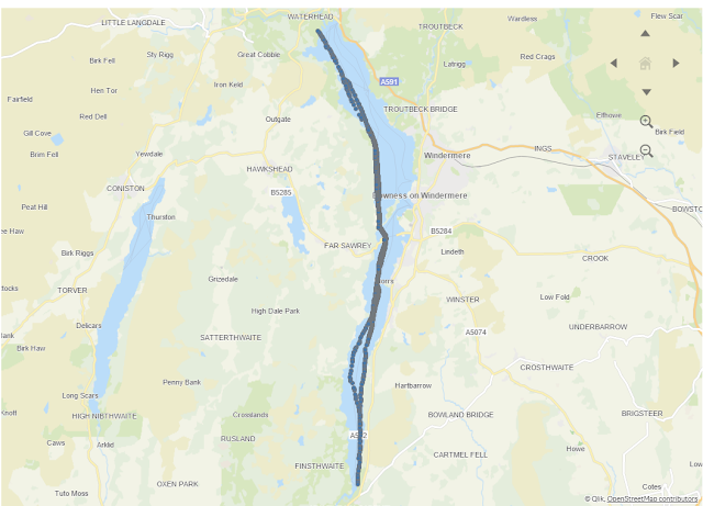
Now to the reason I started this, how do I compare two similar activities. Plotting GPS points on the map, I can select multiple activities through the filters in my app, in this case I select the two Windermere One Way paddles from 2018 and 2019.
From the overlay of both activities I can see that the route taken in 2019 was more direct along the first half of the lake, though took longer to cross the lake. The question I'd ask now is why is that? If you look at the images of both activities from Garmin Connect, you will notice that there was a significant differance in 2019. There is a much straighter route in the first part of the swim, from Fell Foot towards Bowness on Windermere, what you can't see from this data is that there was a significant cross wind in 2019, blowing across the lake in an easterly direction, pushing swimmers (and paddlers) back across the lake.
For information the devices used for this were a Garmin Vivoactive 2 in 2018 and a Garmin Fenix 5s in 2019.
What next?
The next step, bring in weather data to allow better understanding of why 2019 was not quite as efficient from a navigation perspective. Though my swimmer wasn't complaining as he swam a slightly shorter distance.
On a serious note however, this wasn't best route as Windermere is a busy lake with a large number of both commercial and private pleasure boats operating. Ensuring the safety of our swimmers is always the top priority of any safety kayaker or lifeguard. So, being able to utalise data in order to support the understanding of conditions on the day, allows us to support the swimmers in a better and safer environment whilst they are in the water.
I'm greatly looking forward to supporting the 2020 Windermere One Way later this year.
If you've any questions or would like to learn more about this app, feel free to leave a comment.


Interesting. I'm thinking of doing some similar analysis with my fitbit, but it will just tell me I'm fat and lazy.
ReplyDeleteYou should, Fitbit make it much easier with a nice and accessible API to access your own data.
Delete